
The Awesome Reason These Companies Erased A, B And O From Their Logos
by paige_moomey, 9 years ago |
4 min read
These three little letters have a huge impact.
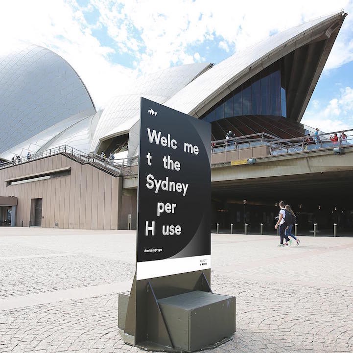
Global brands like Google and Microsoft and landmarks like the Sydney Opera House recently compromised their brand aesthetics for a great cause. The letters A, B and O went missing from their logos and signage. They were just a few of the institutions participating in the #MissingType campaign, an effort aimed at attracting international attention to the need for blood donations. A, B and O are the most common blood types. The campaign, created by the UK’s National Health Service Blood and Transplant and London-based PR agency Engine Group, pointed to the dire need for contributions around the world. The campaign just finished up its second (and first international) iteration, and the timing couldn’t be more urgent. In the past decade, blood donations have dropped by a staggering 30%. According to the World Health Organization, in high-income countries, only about 3.3% of people donate blood, while those in low-income countries donate only .5%. It’s easy to overlook the need for blood donations, but you can be certain these altered icons got some attention. Here are just a few of the emblems that helped illustrate the gap in this crucial necessity.


Doing my bit for @GiveBloodNHS. My #MissingType is O- so dropped off a pint tonight. Now for brew&biccy. #giveblood — @nataliejbowen
A busy day as we went on to give blood with my brother who donated for the first time! #giveblood #MissingType — @nyamoderator
Afsluiter van geweldig leerzame #voka stage bij @RodeKruis! #MissingType — @marc_hendrickxThe campaign encouraged individual donors to participate by removing the letters A, B and O characters from their social media handles in addition to donating blood.
✕
Do not show me this again