These 33 Brand Logos Are Very Different When They Feature Their Competitor's Name
by N/A, 10 years ago |
2 min read
There are a lot of logos that are so ubiquitous that you don't even have to really read what it says to know what brand you're looking at. That's why these images, which use the well known logos, but to advertise their competitor are so jarring.
1. Nike as Puma

2. AT&T as Sprint

3. Netflix as Hulu

4. Android as Apple

5. McDonald's as Burger King

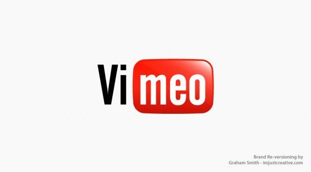
6. YouTube as Vimeo

7. Mastercard as Visa

8. Winston as Malboro

9. Apple as Android

10. Wal-Mart as Best Buy

11. GTalk as Skype

12. Skype as Mastercard

13. Grooveshark as Spotify

14. Vimeo as YouTube

15. Google as Yahoo!

16. UPS as FedEx

17. Ferrari as Ford

18. Twitter as Facebook

19. FedEx as UPS

20. Spotify as Grooveshark

21. Facebook as Twitter

22. Sony as Nintendo

23. Digg as Reddit

24. Skype as GTalk

25. Coca-Cola as Pepsi

26. Sensodyne as Arm and Hammer

27. Cadbury as Hersey's

28. Reddit as Digg

29. Bing as Google

30. Pizza Hut as Dominos

31. Barnes and Noble as Amazon

32. Pepsi as Coca-Cola

33. Nintendo as Sony

✕
Do not show me this again
