
Comic Sans Helps People With Dyslexia
by ilana_gordon, 8 years ago |
4 min read
What do YOU do for others, Helvetica?
Comic Sans is the most divisive font in the history of typography. It’s the 2016 election of typefaces, the O.J. Simpson of lettering. Popularized in the 90s, the unconventional characters quickly became the preferred font of passive aggressive note-leavers and never before has a font seen such a quick rise and fall from grace. People love to hate Comic Sans.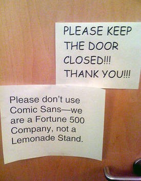
A history of Comic Sans
Comic Sans was designed in the 90s by Vincent Connare, a typographic engineer at Microsoft. The font was intended to be included in the release of Microsoft Bob, an ill-fated piece of software built to increase navigational ease for new computer users. Connare, who also contributed to fonts like Wingdings and Trebuchet, was a fine arts student in New York in the 80s. He tells Great Big Story that at the time, he had a clear benchmark for differentiating between good and bad art. He believed that if you didn’t notice a piece, it was bad. If it caught your eye, it was good. So he set about creating a font that would get noticed.Enter Comic Sans
Comic Sans is notorious for its quirky lettering, which Connare says was influenced by comics like Batman and Watchmen. By 1996, the typeface came preinstalled on every Macintosh — in retrospect, Connare believes creating the font was the best work he’s ever done.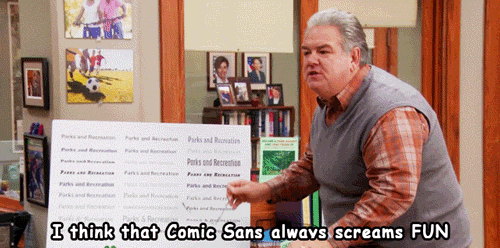
✕
Do not show me this again